The Art of Typeface Selection: How to Choose Fonts That Stand Out
Choosing the right typeface is essential in creating a strong visual identity for your brand. When selecting fonts, it’s important to consider their legibility across different platforms and devices. Start by evaluating the purpose of your content; for instance, a formal document may benefit from serif fonts like Times New Roman or Georgia, while a blog post targeting a younger audience might look better with sans-serif options like Arial or Helvetica. Remember, your typeface should not only reflect your brand's personality but also enhance the readability of your text.
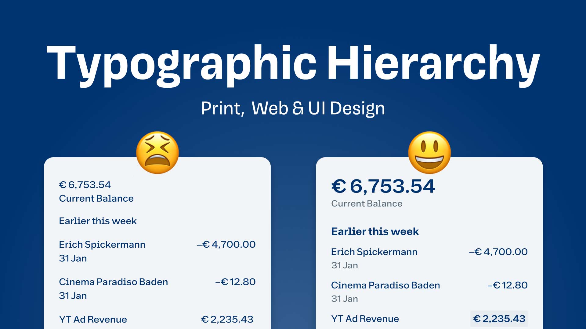
Another key factor in typeface selection is the combination of fonts. Using one or two complementary fonts can create a visually appealing design that captures attention. A common practice is to pair a bold, decorative font for headings with a simpler, more legible font for body text. To achieve this, consider using contrast in weight and style, ensuring that the typography not only stands out but also maintains harmony throughout your content. Experimenting with font sizes, spacing, and alignment is equally important; it allows you to create a balanced aesthetic that draws your readers in.
Top 10 Bold Typefaces That Elevate Your Design Projects
Choosing the right typeface is crucial for the success of any design project, and bold typefaces can significantly elevate your artwork by providing strong visual impact. In this article, we explore the Top 10 Bold Typefaces that not only grab attention but also enhance readability and convey your message effectively. By using these robust fonts, you can create designs that stand out, whether for branding, advertising, or digital content.
- Montserrat – A versatile sans-serif typeface that exudes modernity and professionalism.
- Oswald – Perfect for headlines, this font has a unique geometric style that demands attention.
- Bebas Neue – Known for its clean and bold lines, this typeface is ideal for impactful titles.
- Playfair Display – A serif font that adds a touch of elegance to any design while maintaining bold characteristics.
- Raleway – A sleek and contemporary font that works well in various design contexts.
- Impact – As its name suggests, this typeface delivers a powerful statement, making it a favorite for posters and headlines.
- Anton – This sans-serif typeface is designed for maximum legibility, making it a go-to choice for bold designs.
- Fjalla One – A strong and condensed typeface that fits perfectly in modern layouts.
- Roboto Condensed – Combining readability with a bold presence, this typeface is great for both print and web.
- DIN – Renowned for its industrial feel, DIN's bold version offers clarity and strength in any project.
Why Typography Matters: The Impact of Typeface on Branding and Messaging
Typography is often an overlooked element in branding, yet it carries a profound impact on how a message is perceived. The choice of typeface can evoke specific emotions and associations, shaping the overall perception of a brand. For instance, a bold sans-serif font might convey strength and modernity, while a delicate serif font may suggest tradition and elegance. This means that when businesses select their typographic styles, they should consider not only readability but also the underlying psychology that different fonts can trigger in their audiences.
Moreover, typography plays a critical role in reinforcing a brand's identity. Consistent use of typeface across different platforms and materials helps create brand recognition and enhances cohesiveness in messaging. When consumers encounter a unique and memorable typeface, they are likely to associate it with the brand's values and personality. In an increasingly crowded marketplace, effective typography can be the differentiator that sets a brand apart, making it essential for businesses to invest time in curating their type systems thoughtfully.