The Art of Typography: How Font Choices Impact Web Design
Typography is often considered the unsung hero of web design. The choice of fonts can drastically affect the overall aesthetic and functionality of a website. For instance, a sleek, modern sans-serif font may evoke feelings of professionalism and cleanliness, making it an excellent choice for corporate sites. In contrast, a playful script font might better suit a blog or an artsy portfolio. The right font does more than just look good; it enhances readability and contributes to the overall user experience, influencing how visitors perceive the content on a page.
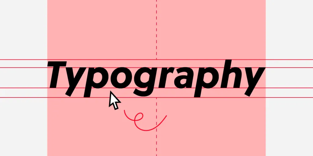
Moreover, typography is not just about picking pretty letters; it involves creating a hierarchy that guides the reader's eye. This is achieved through variations in size, weight, and color. For example, using larger, bolder fonts for headings and more minimal styles for body text can help to break down information into digestible chunks. Creating a visual contrast through typographic choices can also assist in directing attention to key points, enhancing the site’s usability and engagement. By understanding the art of typography, web designers can create more effective and visually appealing websites that resonate with their audience.
5 Essential Typography Tips for an Eye-Catching Website
When it comes to creating an eye-catching website, typography plays a crucial role in maintaining the aesthetic appeal and readability of your content. Here are 5 essential typography tips to enhance your website's design:
- Choose the Right Font Pairings: Select a combination of fonts that complement each other. A common practice is to pair a sans-serif font for headings with a serif font for body text for a visually engaging contrast.
- Establish a Hierarchy: Use different font sizes and weights to establish a clear hierarchy in your content. This helps guide the reader's eye and emphasizes important information.
- Maintain Consistent Spacing: Ensure that your line height and letter spacing are consistent throughout the site. This improves readability and creates a more polished look.
- Consider Contrast: High contrast between text and background is essential for readability. Make sure your text stands out against its background to catch the reader’s attention.
- Limit Font Choices: Using too many fonts can make your site look chaotic. Limit yourself to two or three font families to maintain a cohesive design.
Why You Should Care About Typefaces in Web Development
In the world of web development, the typeface you choose can significantly impact user experience and engagement. A well-selected typeface enhances readability, ensuring that your audience can easily absorb the information on your website. Research indicates that users are less likely to stay on a site that features difficult-to-read fonts, which can result in increased bounce rates. Therefore, focusing on the right typeface can contribute not only to aesthetics but also to the overall functionality and accessibility of your site.
Moreover, different typefaces convey different emotions and brand identities. For example, a sleek sans-serif font might communicate modernity and professionalism, while a whimsical serif font may evoke a sense of creativity and approachability. By carefully considering your typography, you can strengthen your brand message and make a lasting impression on visitors. Remember, the choice of typeface is more than just a design decision; it is an essential part of your website's persona that can drive engagement and influence perceptions.