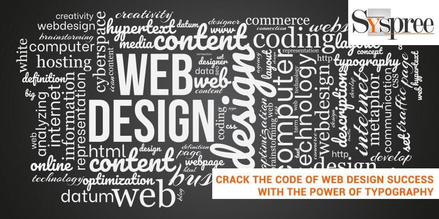
The Art of Web Typography: Transforming Letters for Digital Media
The Art of Web Typography plays a crucial role in shaping the visual identity of digital media. As the Internet continues to evolve, the design and presentation of text have become increasingly important for capturing readers' attention and enhancing user experience. Effective typography not only improves readability but also helps convey the right atmosphere and tone for the content. By utilizing typographic hierarchy, including headings, subheadings, and body text, content creators can guide readers through their articles, making the information more digestible.
To master the craft of web typography, one must understand the various fonts, sizes, and spacing that work harmoniously together. Selecting the right typeface can significantly impact how the message is received, so it's essential to choose fonts that align with the brand's identity and resonate with the target audience. Furthermore, implementing responsive typography ensures that text remains legible across different devices, providing an optimal reading experience. By blending artistic choices with functional design, web typography can truly transform letters into an engaging experience for users.
How to Choose the Perfect Font Pairings for Your Website
Choosing the perfect font pairings for your website is essential for establishing a cohesive brand identity and improving user experience. When selecting fonts, consider readability and contrast. A good rule of thumb is to use one font for headings and another for body text. For example, you might opt for a bold serif font for your headings that draws attention, paired with a clean sans-serif font for the body text, which ensures easy readability. This contrast not only enhances the visual appeal but also helps guide the visitor's focus through your content.
Another important aspect to consider when choosing font pairings is the tone and message of your website. Different fonts convey different emotions; a playful handwritten font may be suitable for a children's site, while a sleek modern font may resonate better with a tech-oriented audience. To ensure harmony, you can refer to established typography principles, such as the 60-30-10 rule, where 60% of your design is in one dominant font, 30% in a secondary font, and 10% in accents. Experimenting with various combinations, while keeping these principles in mind, can lead to the ideal font pairing that truly represents your brand.
What Makes Web Typography Essential for User Experience?
Web typography plays a crucial role in enhancing user experience by ensuring that text is not only visually appealing but also easy to read. The choice of typeface, font size, and line spacing can significantly impact how users perceive and interact with content. For instance, legibility is key; when visitors can easily scan and digest text, they are more likely to stay engaged. Additionally, consistent use of typography across a website contributes to a cohesive visual identity, helping to establish brand recognition and trust.
Moreover, responsive typography adapts seamlessly across various devices, ensuring that content retains its clarity whether viewed on a mobile phone or a desktop computer. This adaptability is essential in today's digital landscape, where users access websites through multiple platforms. By prioritizing typography as an integral part of your design strategy, you not only improve user experience but also enhance accessibility, making your content available to a broader audience, including those with visual impairments.